We were lucky enough to be chosen by Farrow & Ball as a location for their photo shoot for the new Inspiration booklet that may have dropped through your letterbox in the last few weeks.
It was a great week seeing the house transformed last year and we were so keen to show off the new colours but had to wait until publication before we could share them here.
The team were lovely and I can honestly say if I were to re decorate at home again I would definitely use their In Home Colour Consultancy service as their expert knowledge in colours and pairing together is exceptional. I would never have chosen the colours used at The Manor, and we all love them. As do all our guests who have enjoyed the house over the last few months.

The Main Hall was decorated with School House White on the walls, Studio Green on the front panelling and Bancha on the back panelling.

The kitchen was transformed – Sulking Room Pink on the walls and Paen black cabinets. The kitchen is home to the AGA and it is so cosy in there at night and surprisingly fresh during the day. We love it.

The pantry is such fun, painted in Rangwali, I think some fairy lights in here are going to look great.
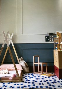
The drawing room became a child’s bedroom for the day. The top colour is Pale Powder and the lower blue is De Nimes. The skirting was a prop skirting so is not in situ in the house but here is painted in Preference Red.
To order your own copy of the Inspiration booklet you will find it Here.
All photographs here have been taken from the Farrow and Ball booklet and are mostly using their own props for decoration.
It was a great experience and we hope host more photoshoots in the future. Our most recent was with The Rug Company and I hope to share photographs from that soon.
T x